
Picture this: you are standing in front of your wardrobe an hour before a family function. You have three kurtas, two dupattas, and absolutely no idea which ones go together. You end up picking the safest option, the plain navy kurta, alone, again, and spend half the evening wondering if you could have done something more interesting.
Most women have been there. And the reason it keeps happening is not a lack of options. It is a lack of a clear framework for putting colour combinations in ethnic wear together confidently. This article gives you that framework, built on real textile knowledge, not recycled styling tips from the internet.
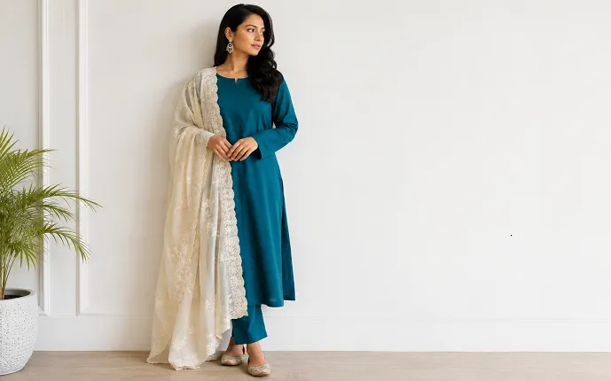
Table of Contents
Why Colour Combinations for Ethnic Wear Feel Harder to Get Right
Western outfits have decades of styling content behind them. You can find a thousand guides on pairing jeans and blazers. Ethnic wear has not had the same treatment, and when it does get written about, it is usually in vague, unhelpful terms like “go for complementary colours” with no explanation of what that actually means in practice.
Ethnic wear also has more moving parts. A salwar kameez set has three pieces: kurta, churidar or palazzo, and dupatta. A saree has a body, a border, a blouse, and a pallu. A lehenga choli has the skirt, the blouse, and often a dupatta or odhni. Every one of those pieces is a colour decision. Getting all of them to work together without looking like a festival decoration is genuinely harder than throwing on a white tee and blue jeans.
The good news: once you understand a few real principles, not rules, principles, it gets significantly easier.
The Colour Combinations That Actually Work for Ethnic Wear
Let us go through the combinations that work reliably across occasions, fabrics, and skin tones.
Deep + Pale: the most forgiving pairing
A rich, saturated base paired with a much lighter accent is almost impossible to get wrong. Think deep teal kurta with an ivory or pale peach dupatta. Bottle green lehenga with a blush pink odhni. Burgundy salwar with a soft cream churidar.
The reason this works: the dark base does the heavy lifting visually, and the lighter accent lifts the face without competing. This is especially effective if you are wearing a kurta colour combination and want the dupatta to frame your face rather than pull attention downward.
Analogous colours: adjacent on the colour wheel
This is an underused combination in ethnic wear, taking two colours that sit next to each other on the colour wheel and pairing them. Rust and mustard. Cobalt and teal. Fuschia and coral. These combinations feel cohesive without being matchy-matchy, and they work beautifully on ethnic silhouettes because the fabrics themselves add enough texture to keep it interesting.
Contrast done right: not just opposite colours
When people think contrast, they jump to red and green or blue and orange, full complementary opposites. That can work, but it is a lot to manage. A more wearable version of contrast is pairing a warm tone with a cool neutral. Mustard with slate grey. Warm orange with off-white. Terracotta with sage green.
Saree Colour Combinations: Where the Blouse Changes Everything
Most women choose a saree and then think about the blouse. That is the wrong order.
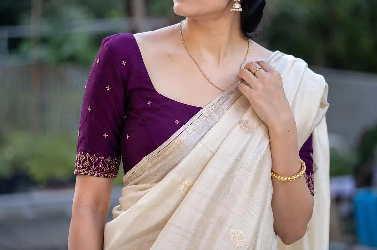
The blouse is where the real colour decision happens. The saree sets the dominant tone. The blouse sets the accent. Getting this relationship right is what separates a saree look that feels deliberate from one that just looks like whatever blouse happened to match at the tailor.
A few combinations worth trying:
- Ivory or cream saree with a deep jewel-toned blouse: emerald, cobalt, deep plum. The saree stays soft and the blouse does the work.
- Printed or embroidered saree: pull one colour from the print for the blouse, not the most obvious one. If your saree has a red, gold, and green border, a deep green blouse is more interesting than a matching red one.
- Bright saree: consider a nude or near-neutral blouse. A bright saree with an equally bright blouse is exhausting to look at for a whole evening.
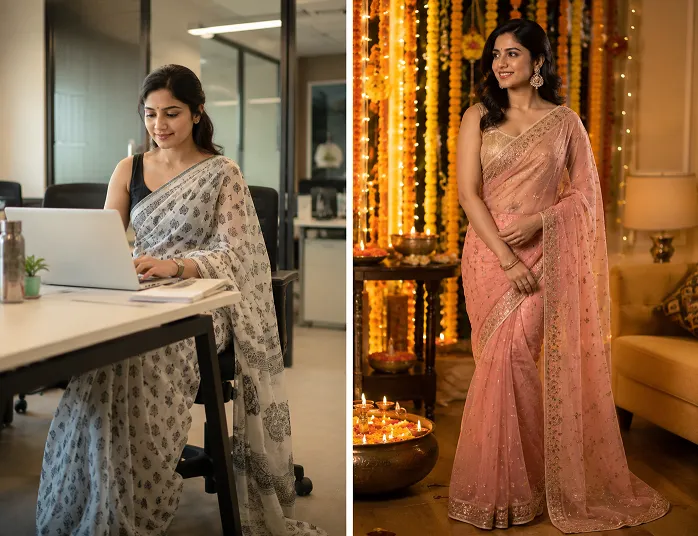
One fabric note here: georgette sarees have more body than chiffon, so they hold the pleats better as you move. When you are choosing saree colour combinations for a long day, a wedding where you will be standing, greeting, walking, a georgette in a deep shade will look sharper by hour five than a chiffon in the same colour. Chiffon softens beautifully in lighter tones but tends to wilt in very dark, heavy shades after a few hours of wear.
And if you are still figuring out which saree silhouette works for you, this guide on choosing a saree for your body type is worth reading before you decide on colour.
Kurta Colour Combinations: When the Dupatta Does Too Much
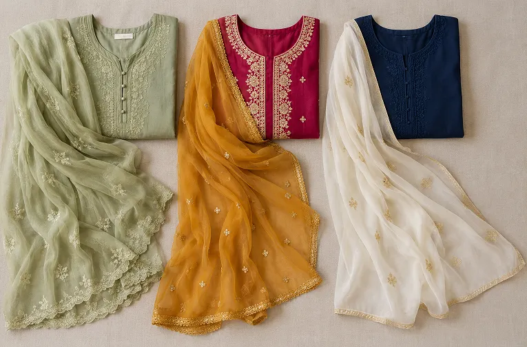
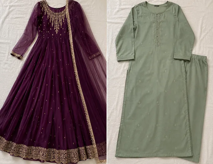
Here is an unpopular opinion: most women over-complicate their kurta colour combinations by trying to match everything. A kurta, a matching churidar, and a dupatta in the same colour family is not a coordinated look. It is a uniform. And it is boring.
The dupatta is not supposed to match. It is supposed to complete.
If your kurta is a warm, solid mustard, your dupatta should either be a cooler contrast (deep teal, cobalt) or a lighter version of the same warmth (cream with a gold border). What it should not be is another shade of yellow. You have already made that statement. The dupatta should answer it, not repeat it.
And if you are in Mumbai in June, this matters even more. Humidity flattens colour. A dupatta in a contrasting tone gives the eye somewhere to travel and makes a wilting cotton kurta look intentional.
If you are dressing for college specifically, this piece on kurta styling for college has more occasion-specific ideas.
Ethnic Wear Colours for Different Indian Skin Tones: What Actually Helps
There is a lot of oversimplified advice floating around about ethnic wear colours for Indian skin tones. “Dark skin should wear bright colours.” “Fair skin can wear everything.” Neither of those statements is useful, and the second one is barely even true.
Here is what actually matters: undertone, not depth of skin.
Indian skin tones run warm (yellow, golden, peachy undertones) to cool (pink, red, ashy undertones) to neutral. Most Indian women lean warm or neutral.
Warm undertones tend to look stunning in earthy shades: terracotta, mustard, rust, burnt orange, warm pinks, deep reds. These colours pull out the golden quality in warm skin.
Cool undertones are flattered by jewel tones: royal blue, emerald, deep plum, fuchsia. These create contrast that makes cool-toned skin look luminous.
Neutral undertones, lucky you. Most combinations work. Lean toward whichever shades make your eyes look brighter.
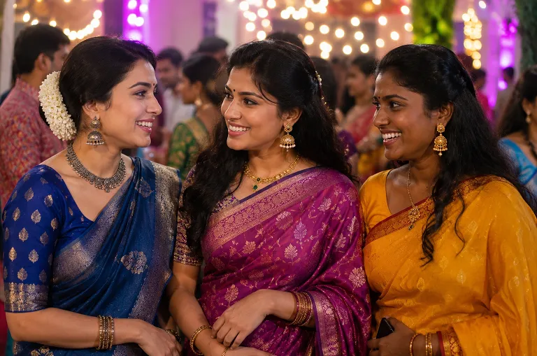
The mistake most women make: they dress for the occasion rather than for how the colour sits on their skin. For Navratri or a college fest, you will wear the colour the day demands, and there is nothing wrong with that. But for a day-to-day kurta or a lehenga you are buying to keep for years, choose the colour that works with your skin, not just the colour that is trending.
One Thing Nobody Tells You About Colour and Fabric
Colour does not behave the same way across fabrics. This is something you only really understand once you have spent time around actual textile production.
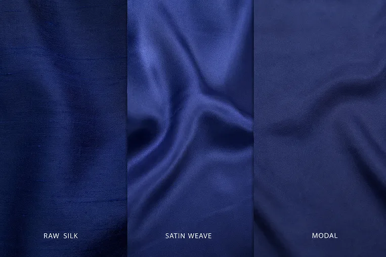
The same shade of deep blue looks completely different on a matte raw silk versus a shiny satin weave versus a flowy rayon. Raw silk absorbs light, so the colour looks deeper and more muted. Satin reflects it, so the same blue reads almost electric in direct light. Rayon sits somewhere in between, but it has a tendency to show sweat, which in a dark shade means uneven colour patches by afternoon.
Modal fabric, which many brands now use for kurtis, looks similar to rayon on the hanger. But it does not cling to the body the same way in humidity. For summer ethnic wear, this difference is actually significant. A modal kurta in a bright coral will look the same at 6 PM as it did at 10 AM, while a rayon in the same colour might have darkened at the underarms.
Colour is never just colour. It is always colour plus fabric plus light plus occasion. If you want to go deeper on fabric choices for warmer months, read our guide on the best saree fabric for summer.
Conclusion
The most important shift you can make is to stop thinking about colour combinations as rules to follow and start thinking about them as a conversation between pieces. Your saree is saying something. Your blouse is responding. Your dupatta is finishing the thought. Once you start thinking about it that way, getting dressed stops feeling like a puzzle and starts feeling like something you are actually in charge of.
For more ideas on dressing for specific occasions and understanding how fabric changes everything, keep reading at ethora.in.
FAQ
Which colour combinations work best for a saree at a daytime wedding?
Daytime weddings mean a lot of natural light, which is actually very forgiving. Pastels and mid-tones photograph beautifully in daylight: dusty rose, sage green, soft lavender. Pair these with a deeper blouse in emerald, navy, or burgundy. Avoid very dark sarees in full afternoon sun; they absorb heat quickly and heavy drapes in dark silk will make you uncomfortable within the first hour.
What dupatta colour goes with a maroon kurta?
Maroon is a deep warm tone, so your dupatta options are: a cool contrast like dusty blue or slate grey, a lighter warm tone like blush pink or soft peach, or a gold dupatta if it is a festive occasion. Avoid pairing maroon with red or deep orange, the warmth competes and the combination reads as too heavy. A pale ivory dupatta with a gold or silver border is the most versatile choice if you want something you can keep reaching for.
Are dark colours good for Indian skin tones?
Yes, but the way they work depends on your undertone, not just your skin depth. Deep jewel tones like emerald, royal blue, and deep plum work beautifully on cool or neutral undertones. If you have warm undertones, deep earthy shades like wine, burnt sienna, or forest green tend to look richer than cooler dark tones. The fabric matters here too: a matte fabric in a dark colour reads differently than the same shade on a shiny weave, and matte is generally safer for everyday wear.
Can I wear a printed kurta with a printed dupatta?
You can, but it needs careful handling. The prints should be different in scale, one large, one small, and share at least one colour. A large floral kurta with a thin geometric border dupatta works. A large floral kurta with a similarly sized geometric dupatta is usually too busy. If you are unsure, go with a plain dupatta that picks up one colour from the print. That will never go wrong.
What colours should I avoid for Diwali ethnic wear?
Avoid whites and very pale pastels for Diwali, they get lost in evening lighting and photograph flat. Diwali is an occasion where deeper, richer tones actually work in your favour: deep red, cobalt blue, emerald, gold and warm orange. Evening lighting, whether from diyas or indoor lighting, tends to be warm-toned, so colours with warm undertones glow more than cool-toned shades under those conditions.
Pingback: 8 Saree Blouse Back Designs For Every Body Type | Ethora
Pingback: 4 Real Ways To Pick Saree Colour For Skin Tone | Ethora
Pingback: Saree Trends For Young Women That Actually Work In 2026 | Ethora