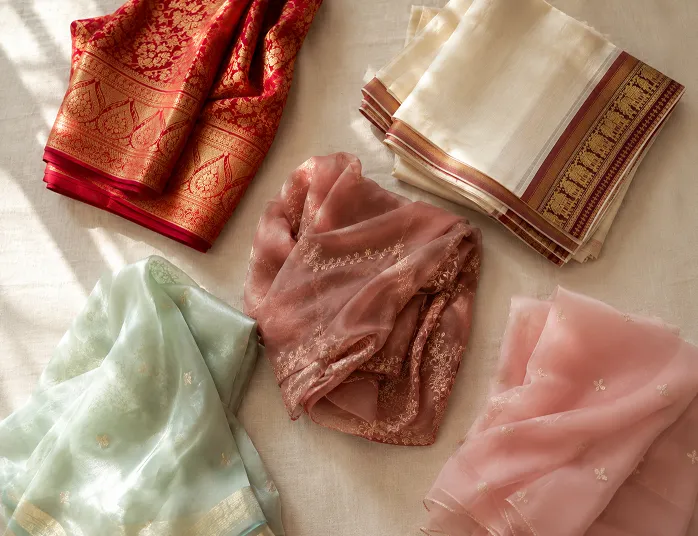
Two sarees, same rack, same shop, same lighting. One makes you look like you glowed up for no reason and the other makes you look like you did not sleep well. You have felt this before even if you could never explain it to the shopkeeper standing there waiting for you to decide. It is not the saree. It is the colour, and specifically, how that colour sits against your skin.
This article will cover the usual undertone basics because you deserve that foundation. But it goes further than that. We will get into a personal colour analysis method that nobody is applying to sarees, why the same colour looks completely different in your bathroom mirror versus your cousin’s wedding video, and a five minute test you should do before you ever hit buy on an online saree order. By the end, picking your saree colour for skin tone should feel less like guessing and more like actually knowing.
Table of Contents
Saree Colour for Skin Tone Starts With Your Undertone, Not Fair or Dusky Labels
Most articles on best saree colours start by sorting women into fair, wheatish, or dusky. Skip that. Skin depth tells you almost nothing useful. Undertone does.
Your undertone is the colour underneath your skin, the one that stays constant whether you are tanned from a Rajasthan summer or paler after monsoon indoor months. There are three:
- Warm undertone: your veins look more green than blue on your wrist, gold jewellery looks better on you than silver, and you tan easily rather than burn.
- Cool undertone: your veins look distinctly blue or purple, silver jewellery flatters you more, and white paper looks more blue-white against your skin than cream-white.
- Neutral undertone: honestly, both silver and gold look fine, and the vein test gives you a confusing mix. This is more common than people admit.
Here is the part most guides skip. Warm undertones generally carry rust, mustard, brick red, olive, and warm coral beautifully. Cool undertones lean into jewel tones like emerald, sapphire blue, magenta, and true reds without any orange in them. Neutral undertones have the easiest life here because dusty rose, teal, and most mid tone colours sit well without a fight.
One honest opinion: the vein test is a starting point, not gospel. I have seen women with clearly warm veins who look stunning in a cool toned wine coloured Banarasi silk saree because the fabric’s sheen changes how the colour reads. Undertone matters, but it is not the only variable in the room.
The Seasonal Colour Analysis Framework, Applied to Sarees
If you spend any time on Instagram or TikTok, you have probably seen the seasonal colour analysis trend, where people get sorted into Spring, Summer, Autumn, or Winter based on their skin, hair, and eye colouring. It comes from an older western personal colour theory that stylists have used for decades, and almost nobody has actually mapped it onto Indian saree colours. So let us do that properly.
Spring: warm undertone with a lighter, brighter overall colouring, often lighter brown or hazel eyes. Sarees in coral, warm peach, golden yellow, and light turquoise work well. A Spring woman in a mustard chiffon saree with light gold zari looks genuinely lit up, not washed out.
Summer (in this framework, this has nothing to do with the actual weather, which confuses people every time): cool undertone with softer, muted colouring. Think dusty rose, soft lavender, powder blue, sage green. Avoid anything too saturated or neon, it will overpower rather than complement. A soft grey-lavender georgette does more for a Summer woman than a bright fuchsia ever will.
Autumn: warm undertone with deeper, richer natural colouring, often darker eyes and hair with warm brown or black shades. This is where rust, deep olive, burnt orange, and warm brown sarees genuinely sing. Most Indian brides going for a mehendi function outfit fall into this bucket without realising it, which is exactly why mustard and rust dominate mehendi fashion.
Winter: cool undertone with high contrast colouring, very dark hair against fair or deep skin. Winter carries true red, emerald, royal blue, and stark white with real drama. If you have ever noticed that some women can pull off a pure white saree at a function while it makes others look flat and tired, undertone contrast is usually why.
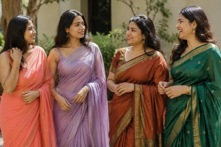
This is not a rigid box you have to squeeze into. Most Indian women land somewhere between two seasons, and that is fine. Use it as a filter, not a cage. If a colour keeps showing up as flattering across multiple methods, the vein test, this seasonal framework, and how you feel wearing it, that is your answer. This seasonal lens is simply one more way to narrow down saree colour for skin tone, not a replacement for the basics.
Once you have your base shade sorted, the next decision is what to pair it with, since a wrong blouse or border colour can undo all this work. We have gone deeper into that exact problem in our guide on colour combinations for ethnic wear, which is worth a read before you finalise anything.
How Saree Colours Actually Look in Photos vs Real Life
Here is something nobody tells you until you have already ordered the wrong saree online. The colour you see on your phone screen, the colour that shows up in a WhatsApp forwarded photo, and the colour that shows up in person under a warm mandap light are three different things.
Pale pastels are the biggest trap. A soft mint or baby pink saree that looks fresh and pretty in daylight photography can turn almost grey and lifeless under the warm yellow tungsten lighting most Indian function halls and mandaps use. That warm light adds an orange cast that flattens pastels and makes them look duller than they are. Meanwhile, jewel tones like emerald, wine, and royal blue actually get richer under warm lighting, which is part of why they photograph so well at evening functions.
Pure white behaves strangely too. Under phone camera flash, white sarees often blow out and lose all texture in photos, which is why a heavily worked white Banarasi can look flat and washed out in your function photos even though it looked stunning in person. If you are someone who photographs every outfit for Instagram, and let’s be honest, most of us do now, factor this in before you commit to a pale shade for an evening event.
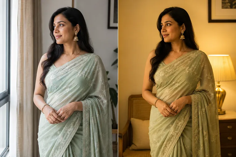
And here is the mistake most women make: they pick a saree colour standing under bright white shop lighting or based on how it looks in a product photo shot with professional studio lights, then wear it under a warm-lit venue and wonder why it does not look the same. Shop lighting and phone screens lie. Natural daylight and the actual venue lighting tell the truth.
The Swatch Test Before You Buy Online
So how do you actually know a colour will work before you commit to buying it, especially when you are ordering online and cannot touch the fabric first?
Ask for a fabric swatch, or if that is not possible, look at the smallest, most zoomed out product photo available, ideally one in natural daylight rather than the hero shot. Then do this: hold whatever swatch or reference you have near your face, next to a window in natural daylight, not under a tube light or LED bulb. Look at your face in a mirror while holding it there. Does your skin look brighter or does it look tired. That five minute check tells you more than any undertone quiz ever will.
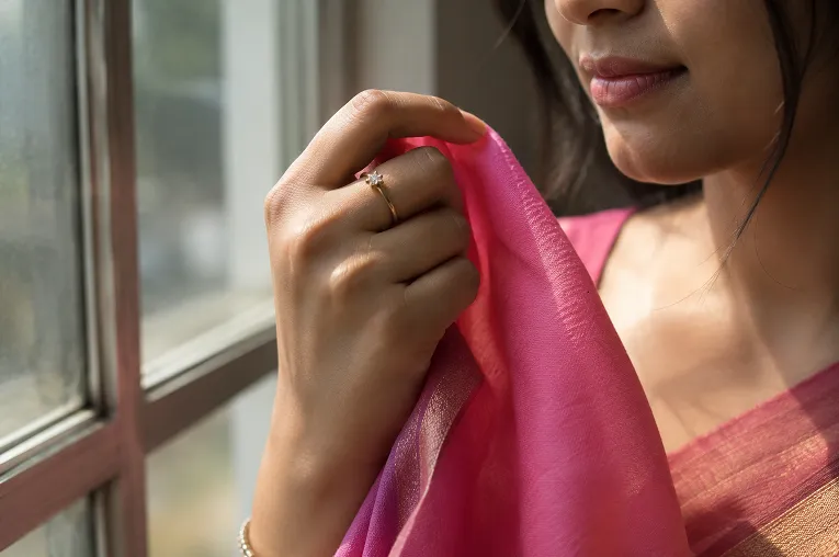
If you already own a dupatta or scarf close to the shade you are considering, use that instead of guessing from a screen. Fabric colour under real daylight is the closest you can get to the truth without physically visiting a store.
A small technical detail that matters here: georgette and chiffon reflect light differently than a matte cotton or silk. A colour that looks dull in cotton can look far richer in a georgette because of how the fabric’s sheen bounces light back. This is why the same “dusty rose” can look completely different depending on which fabric it is woven into, and why a swatch test with the actual fabric type you are buying matters more than checking against a random pink dupatta.
Occasion Based Recommendations That Actually Hold Up
Undertone theory is useful, but real life has occasions, and occasions come with their own lighting and their own expectations.
For a Navratri garba night, you are dancing under coloured stage lights for hours, so go bold. Bright colours like magenta, turquoise, and mustard hold their vibrancy under coloured lighting far better than muted pastels, which tend to disappear entirely. If Navratri planning interests you, our Navratri outfit guide covers this in more depth including fabric choices for hours of movement.
For a daytime wedding or haldi function, warm yellows, corals, and light greens photograph beautifully in natural sunlight and suit most undertones reasonably well, which makes them a safer bet if you are unsure of your own colouring.
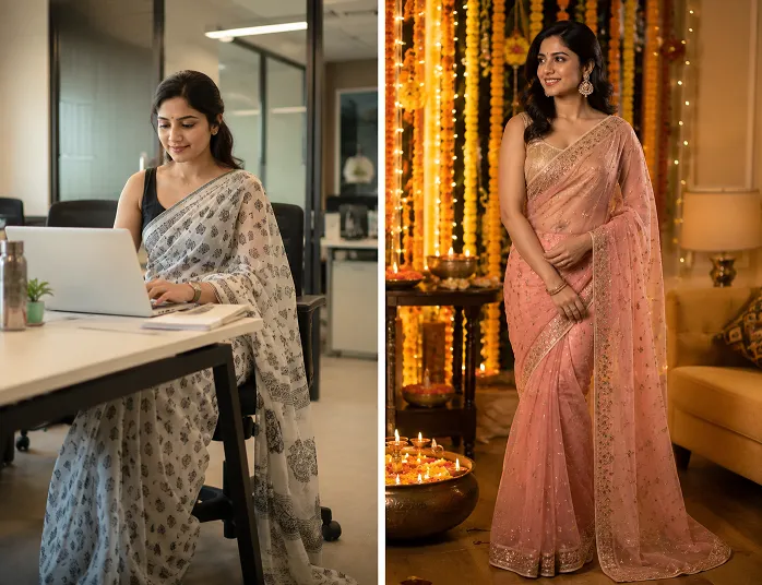
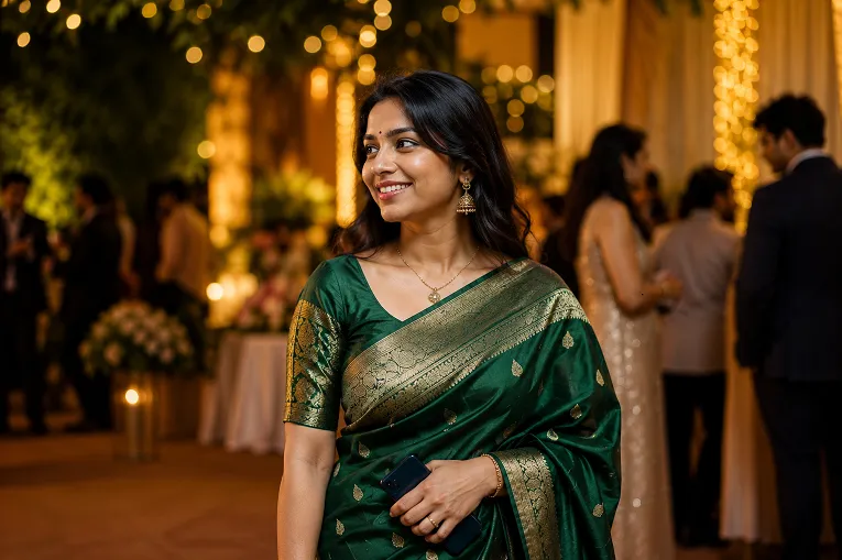
For evening receptions and sangeet nights under warm artificial lighting, lean into jewel tones. Emerald green, wine, deep teal, and royal blue hold their richness and actually look more expensive under warm light than they do in daylight.
For office wear or everyday saree days, softer, more muted tones in cotton or linen work best. You are not competing with stage lighting here, you want something that looks put together in ordinary fluorescent office lighting without shouting for attention.
Unpopular opinion, stated plainly: everyone tells dusky skinned women to avoid pastels entirely, and that advice is lazy. A well chosen dusty rose or sage green georgette, tested properly in daylight first, can look genuinely stunning on deeper skin tones. The blanket “avoid pastels” advice ignores fabric, sheen, and exact shade, and it needs to stop being repeated without qualification. Whatever the occasion, the right saree colour for skin tone should adapt to the lighting and mood of that event, not fight it.
What Actually Matters Before You Buy
Every buying decision eventually comes back to one question, does this saree colour for skin tone actually hold up once you are wearing it under real light and not just under shop lighting. Colour is only half the decision. The fabric carrying that colour decides whether it actually looks good once you are wearing it and moving through your day.
Check the weight of the fabric against the occasion. A heavy Banarasi silk holds colour beautifully and drapes with real structure, but the weight on your shoulder from the pallu starts to show by evening if you are wearing it for a full day event like a wedding. For long functions, a lighter georgette or a well finished chiffon gives you the colour richness without the shoulder fatigue.
Look at the zari or border finishing closely. Cheap versions often use a shinier, almost plasticky gold thread that looks harsh under warm lighting, while genuine zari has a slightly duller, more antique gold quality that photographs and drapes better. And check how the fabric holds a pleat. Georgette has more body than chiffon so it holds the pleat better when you are walking, which matters more than people realise until they are adjusting their pallu every ten minutes at a function.
This is exactly the kind of detail that only comes from actually handling fabric at scale. Ethora manufactures sarees directly at our own unit backed by Pahal Silk Mills in Surat, and for pieces outside our own production, we source directly from Surat’s local textile market, India’s largest textile hub, so what you are reading here comes from people who work with these fabrics daily, not from a styling opinion borrowed off another website.
Conclusion
Your saree colour for skin tone is not just about the shade you pick. It is about picking that shade in the right fabric, tested in real daylight, for the right occasion. Get those three things aligned and the compliments stop being about the saree and start being about how good you look in it, which is really the whole point.
Explore more styling guides on the Ethora blog while you are here, there is a lot more to unpack beyond just colour. Our store is launching soon, with pieces made and sourced directly from Surat’s manufacturing units, so you get the real thing without the middleman markup.
FAQ
How do I know my skin undertone for choosing a saree colour?
Check the veins on the inside of your wrist in natural daylight. Green veins usually mean a warm undertone, blue or purple veins usually mean a cool undertone, and a mix of both usually means neutral. Also notice whether gold or silver jewellery looks better against your skin, since that is often a faster and more reliable clue than the vein test alone.
Can dark skin wear light coloured sarees?
Yes, and this is one of the most repeated myths in Indian fashion. Deeper skin tones often carry bright, saturated pastels and jewel tones beautifully because of the natural contrast, while very pale, washed out pastels can look flat on any skin tone, fair or dusky. The colour depth matters more than the general rule of “light versus dark.”
Why does my saree look a different colour in photos than in person?
Warm artificial lighting at most Indian venues adds an orange cast that dulls pastels and richens jewel tones, while phone camera flash can wash out pale and white sarees entirely. This is why a colour that looked perfect in the shop or on screen can look completely different in your function photos.
What saree colours suit a wheatish skin tone?
Wheatish skin usually pairs well with warm undertone colours like rust, mustard, coral, and olive, though this depends more on your actual undertone than your depth of skin colour. A wheatish woman with a cool undertone will still suit jewel tones like emerald or wine better than warm rust shades.
How do I know if a saree fabric is good quality before buying it online?
Look closely at how the fabric catches light in the product photos, genuine silk and good georgette have a soft, natural sheen rather than a flat or overly shiny plastic-like look. Check the zari work too, real zari has a slightly muted, antique gold tone rather than a bright synthetic shine. Ethora manufactures directly at its own Surat unit and sources everything else from Surat’s local manufacturers, which means the fabric knowledge behind our recommendations comes from people who handle these materials daily, giving you factory level quality without the middleman markup.
Once you know which shades actually work for your skin tone, the next step is finding them in a fabric that does the colour justice. Ethora manufactures its sarees directly at its own unit in Surat, backed by Pahal Silk Mills, and sources everything outside our own production straight from Surat’s local textile market, India’s largest textile hub. Our store is launching soon, bringing you shades tested in real light, in fabric worth trusting, straight from the source.