You are standing in front of your wardrobe with a printed kurta in one hand and a printed dupatta in the other, and you genuinely cannot tell if this will look put together or like you got dressed in a hurry. This happens to almost every woman who owns more than three printed pieces.
Mixing prints in ethnic wear looks effortless on other people and impossible on yourself, mostly because nobody explains why some print combinations work and others just do not. This article fixes that, with the actual reasoning behind it, not the same tired rule every fashion blog repeats.
Table of Contents
Mixing Prints in Ethnic Wear: Why the Basic Rule Only Gets You So Far
Every fashion blog tells you the same thing. Pair a busy print with a solid colour. If both pieces are printed, match the colours.
It is not wrong advice. But it is incomplete, and that is why you can follow it perfectly and still end up with an outfit that feels slightly off.
The busy-plus-solid rule works as a starting point. A printed kurta with a plain dupatta, or a plain kurti with a printed palazzo, is close to foolproof because you are only handling one pattern at a time.
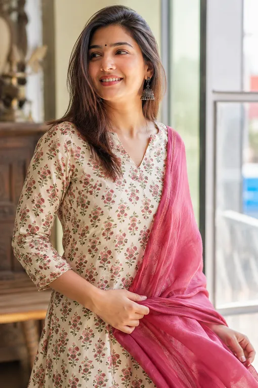
The real challenge in mixing prints in ethnic wear starts when two different prints share one outfit, and that explanation has almost nothing to do with colour.
The Real Reason Two Prints Clash: Scale, Not Just Colour
Here is the part nobody tells you. Two prints do not clash because they are both printed. They clash when your eye cannot tell them apart as two separate things.
Picture a large floral motif on a dupatta paired with a tiny geometric print on a kurti. The eye reads these as two distinct visual elements, one big and slow, one small and busy. It processes them separately instead of fighting to merge them into one pattern.
Now put two medium scale florals together, even in matching colours. The eye cannot separate them anymore. They blur into visual noise, and that noise is what people describe as clashing, even when the colour palette is technically coordinated.
This is scale contrast, and it matters more than colour matching ever will. A bold Ajrakh print bottom with a fine Bandhani dot dupatta works because the scale gap does the job colour coordination alone cannot do.
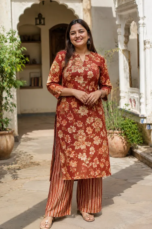
Here is an unpopular opinion. Colour matching gets far too much credit in print pairing tips you read online. Two prints in completely unrelated colours can still work fine as long as the scale contrast between them is strong enough. Colour is the easy fix stylists reach for because explaining scale takes more effort.
Actually, colour matching without scale contrast is the mistake most women make. They buy a printed set because the shades coordinate, then wonder later why it still looks busy on the body instead of curated.
Keep Your Busiest Print in One Zone Only
Once you understand scale, the next question is placement. Where does the busy print actually live on your body?
The answer is simple. Pick one zone, dupatta, blouse, or bottom, and let the busiest print own that zone completely. Everything else stays quiet.
A printed dupatta over a printed blouse is where most attempts at how to mix patterns fall apart. You are asking the eye to process two busy zones at once, on two different planes of the body, and it reads as competing rather than intentional.
This is the containment rule. It explains why a heavily printed Patola dupatta looks stunning over a plain silk blouse, but the same dupatta over a printed blouse looks like two outfits accidentally worn together.
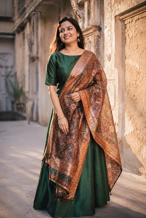
If you want a print pairing to look styled instead of thrown together, this single zone rule matters more than matching colour families exactly.
The Fabric You Choose Changes How Loud a Print Looks
This is the part that surprised me most when I started spending time around the printing floor at our unit in Surat, and stylists rarely mention it.
The same print reads completely differently depending on what it is printed on. A busy print on matte cotton or handloom fabric sits calmly because the fabric itself adds no extra movement under light. The print does the talking, and nothing else competes with it.
Put that exact same print on a shiny silk or a reflective georgette, and it gets louder. The sheen catches light with every fold and step, and that movement amplifies the print, sometimes to the point where a moderate motif starts to feel overwhelming.
I have seen the same Bandhani design printed on cotton and on a glossy art silk look like two entirely different prints once worn, even though the artwork on both was identical. Fabric finish decides how busy a printed ethnic wear combination actually looks once you are standing under tube lights at a function, not how it looks flat on a shop table.
You can read more about how this kind of print tradition developed through the documented history of Bagru print, a form of hand block printing from Rajasthan practiced by the Chhipa community of artisans for generations.
Georgette has more body than chiffon, so a georgette dupatta holds its printed pleats with more structure while you are walking. The same print on chiffon moves softer, almost like it is floating rather than sitting on you.
Mixing Prints for Different Occasions
Navratri nights, wedding season and a regular Tuesday at the office all call for different print energy. Reading the room matters as much as reading the print itself.
For Navratri and garba nights, bold scale contrast actually works in your favour. The lighting, the movement, the sheer chaos of a garba circle means a strong busy-versus-fine print pairing reads and photographs better than something subtle. Our guide on Navratri outfit ideas for garba night breaks down more of what works once you are actually on the dance floor.
For office wear or a family lunch, keep the scale contrast gentler. A fine print bottom with a small motif top and one solid piece reads polished without looking like you tried too hard for a Tuesday.
For weddings and heavier events, the containment rule becomes your best friend. Let one statement zone carry a bold traditional print like Ajrakh or Bagru, and keep the rest of the outfit, jewellery included, deliberately restrained. Our piece on colour combinations for ethnic wear that actually work goes deeper into building the palette around whichever print anchors the look.
And if a printed dupatta is part of the mix, how you drape it changes how much of the print actually shows. Our dupatta draping styles guide is worth checking before you decide which zone gets the busy print.
What to Check Before You Buy a Printed Piece to Mix
Before adding another printed piece to your wardrobe with the intention of mixing it, check the fabric finish first, not just the print itself.
Hold the fabric under normal daylight, not shop lighting, and see how much it catches and moves. A busy print on a high sheen fabric will read louder at the actual function than it did in the store, so if you already own quieter pieces to pair it with, a matte or semi matte finish gives you more control.
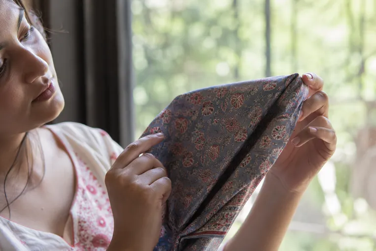
Also check how the print sits at the seams and repeats. A print with visible cutting mismatches at the joins never looks intentional, no matter how carefully you style around it.
This is exactly the kind of check our team makes daily. Ethora manufactures its sarees, salwar kameez, kurtas and lehenga choli directly at our own unit in Surat, and sources everything else from Surat’s local textile market, so the fabric advice here comes from people who handle these prints before they ever reach a wardrobe.
You can also cross check authenticity claims on genuine hand block printed pieces against the government’s own Handloom Mark scheme, set up to give consumers assurance about the authenticity of handloom products.
Conclusion
The single thing to remember about mixing prints in ethnic wear is that scale, not colour, decides whether two prints work together. Pick your zone, keep the rest of the outfit quiet, and check the fabric finish before you commit to a piece.
Once that clicks, print mixing stops feeling like a risk and starts feeling like the easiest way to make an ordinary outfit look considered.
There is more styling breakdown like this one waiting on the Ethora blog if you want to keep sharpening your eye for it. Our store is launching soon, with pieces manufactured at our own Surat unit and sourced directly from Surat’s textile market, so what you find there carries the same fabric-first thinking as this article.
FAQ
Can I mix two floral prints in one outfit?
Yes, if the scale is clearly different, for example a large floral dupatta with a small ditsy floral kurti. Two florals of the same size in the same outfit tend to blur together no matter how well the colours match.
Is it okay to mix prints for a wedding?
It works well if you keep the print contained to one zone, usually the dupatta or the blouse, and let heavier embellishment carry the rest of the look instead of a second print. Bold traditional prints like Ajrakh or Bagru read as intentional at weddings when the rest of the outfit stays restrained.
Does mixing prints work for petite body types?
It can, but keep the busiest print on the smaller portion of the outfit, like a fitted top or a dupatta, rather than a full printed lehenga or palazzo, since a lot of large scale print can visually overwhelm a smaller frame. This is not a rule that applies the same way to every body type, so treat it as a starting point rather than a fixed law.
How do I know if a printed fabric is good quality before buying it online?
Check whether the print is placed with clean, even repeats and no visible misalignment at the seams, and ask whether the fabric is handloom, mill made, or hand block printed since that changes both the price and the drape. Ethora manufactures sarees, salwar kameez, kurtas and lehenga choli directly at its own Surat unit and sources everything else straight from Surat’s local textile market, which means you get factory-level fabric knowledge and pricing without a middleman marking it up.
Do prints clash more on silk than on cotton?
Often yes, since smooth silks with a high sheen make a print look busier because the surface reflects light. Tussar silk is an exception since its slightly nubby, raw texture softens the print edges compared to a smooth mill silk, so a bold print reads calmer on tussar even though it is still silk. If you are new to mixing prints, cotton or tussar will be more forgiving than a glossy art silk.
Once you start noticing scale contrast, you will spot it in every outfit you own, and in half the ones you don’t. Ethora manufactures sarees, salwar kameez, kurtas and lehenga choli directly at our own unit in Surat, and everything else we carry is sourced straight from Surat’s local textile market. Our store is launching soon, built entirely on that same fabric-first thinking.