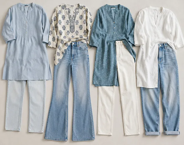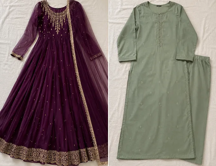
You bought the plain white kurti because it promised to go with everything. Then it sat in your cupboard for three weeks because you could not decide what “everything” actually meant. That is the real problem nobody warns you about when they tell you to invest in basics.
A plain kurti is not automatically easy. It is a blank canvas, and blank canvases need a plan, not a guess made in front of the mirror at 8 AM while the auto is already waiting downstairs.
This guide is built around real contrast dupatta options for plain white kurti outfits, but it goes further than most articles on this exact topic. Colour is only one part of the decision.
The bottom you choose and the fabric texture of your dupatta change the entire look just as much. We are covering all three pieces together, because that is how outfits actually work in real life.
Table of Contents
The Three-Piece Rule Nobody Talks About
Most advice online stops at kurti and dupatta, as if the pants or palazzo you are wearing do not matter. They matter more than people admit.
Think of your outfit as three separate decisions that have to agree with each other: the kurti colour, the dupatta colour or print, and the bottom colour. Change any one of them and the whole balance shifts, sometimes for the better and sometimes not.
A rust dupatta on white looks completely different with beige palazzo than it does with white churidar. Same kurti. Same dupatta. Different bottom, different outfit. This is the actual solid kurti colour combinations matrix you need in your head before you get dressed, not just a dupatta shade you liked on Pinterest.
Contrast Dupatta Options for Plain White Kurti: The Full Matrix
Here are six three-piece combinations that skip the usual mustard with teal or black with gold pairings you have already seen on every other fashion blog. Each one calls out texture separately from colour, because texture is doing more work than you think.
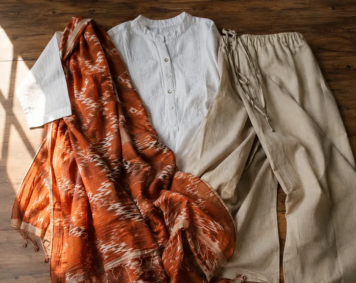
Rust cotton Ikat dupatta with off-white palazzo. This is your daytime, run-errands-and-still-look-put-together combination. The rust brings warmth against white without shouting, and the Ikat print gives the dupatta a handloom texture that a plain-dyed dupatta in the same rust shade simply will not have.
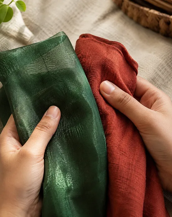
Bottle green organza dupatta with white straight pants. Keep the pants white so the green has room to be the only strong colour in the outfit. Organza catches light in a way cotton never will, which is what makes this feel dressed up even though nothing about the combination is complicated.

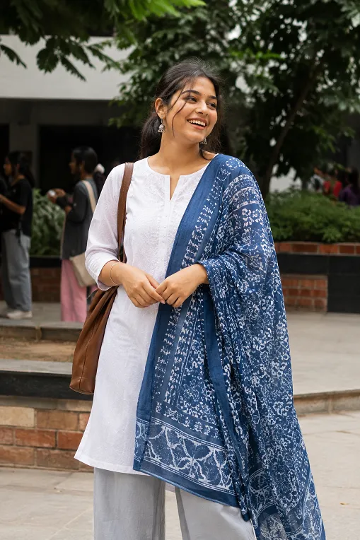
Indigo block-print cotton dupatta with grey palazzo. The grey bottom stops the outfit from reading as two competing brights, and the block print gives you a textile story worth a compliment or two. This one works well for a college fest or a casual family gathering.
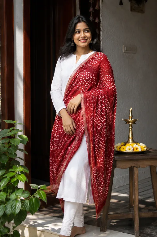
Brick red bandhani dupatta with white churidar. Bandhani has a slightly puckered, textured surface from the tie-dye process itself, so even a plain white churidar underneath does not feel plain once you add this dupatta. Good for puja mornings and small family functions.
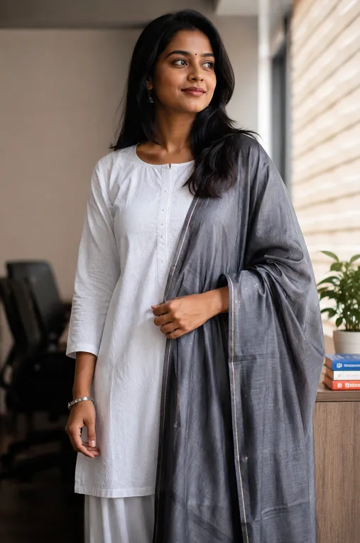
Charcoal grey chanderi dupatta with white palazzo. Chanderi has a soft sheen without being loud, which makes this your office-appropriate contrast option. It reads composed, not costume-y, and that difference matters more at work than most people realise.
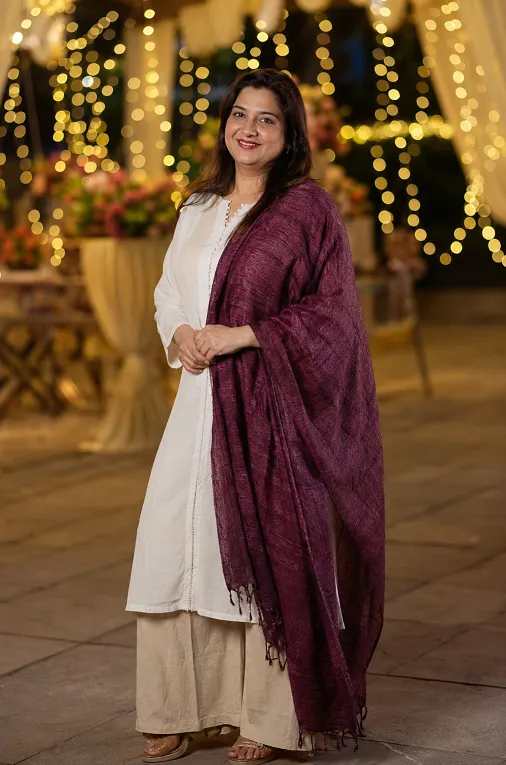
Plum tussar silk dupatta with beige palazzo. Tussar has a slightly rough, nubby hand that catches light unevenly, in a good way. Beige keeps the palette calm enough that the plum does not overwhelm, which makes this a strong pick for a wedding guest look that is not the bride’s colour but still feels festive.
Why Texture Is the Real Lever, Not Just Colour
Here is where most articles stop short, and where you will actually start seeing a difference in how your outfits look.
A plain cotton kurti with a plain cotton dupatta in a contrasting colour still looks fairly basic, even if the colour choice is technically correct. The exact same colour pairing in an organza or textured handloom dupatta instead looks noticeably more elevated, purely through the texture change. Nothing else moved. Just the fabric.
This is not a small detail. It is a separate dimension from colour entirely, and once you start noticing it, you cannot unsee it. It is also why the best contrast dupatta options for plain white kurti looks are rarely the ones with the boldest colour, they are the ones with the most interesting fabric.
Chanderi has a soft sheen and a slight stiffness that holds its shape when draped over one shoulder. Georgette, on the other hand, has more body than chiffon, so it holds a pleat better when you are actually walking and not standing still for a photo. These are not interchangeable fabrics even in the same colour.
There is a sensory difference too. Organza feels crisp and almost papery between your fingers, cotton dupattas feel soft and settle close to the body, and tussar has a dry, slightly rough texture that catches light unevenly as you move.
Handloom weaves carry small, deliberate irregularities that machine-made fabric does not, which is part of why India’s handloom weaving tradition is celebrated as its own craft rather than treated as a cheaper alternative to mill-made cloth. That irregularity is exactly what reads as premium.
If colour matching still feels confusing on its own, Ethora’s free kurti colour matching tool gives you a starting palette in under two minutes based on the kurti shade you already own.
Mix and Match Pant Colors for Solid Kurti Sets
Once the dupatta is decided, the bottom is where most women give up and default to white or black without thinking it through.
Here is the actual logic. If your dupatta is bold and textured, keep the bottom quiet, in white, beige, or grey. If your dupatta is a softer, more muted shade like charcoal or plum, you have more room to bring in a stronger bottom colour like deep bottle green or rust without the outfit fighting itself.
Most women choose their pant colour based on what is already ironed and ready in the cupboard. That is the wrong way to build an outfit, even though it is the most common one. A five-minute decision at the start saves you from a mismatched photo later.
For more ready combinations built around this same logic, Ethora’s guide on colour combinations for ethnic wear that actually work goes deeper into pairing rules beyond just the white kurti scenario.
What If You Have a Black Kurti Instead?
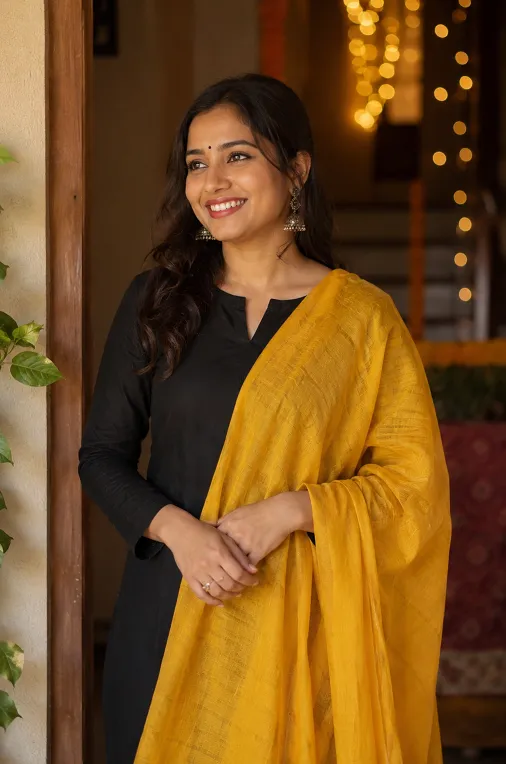
The same three-piece thinking applies, but the contrast math flips. Contrast dupatta styling for plain black kurti works best with lighter, brighter dupattas since black already anchors the outfit and does not need another dark piece competing with it.
A marigold yellow cotton dupatta or a dusty rose chanderi against black reads far fresher than the black-and-gold pairing everyone defaults to. And honestly, that is an unpopular opinion worth saying out loud: gold on black looks safe, but it rarely looks memorable.
Skipping Contrast Altogether: Monochromatic Ethnic Co-ord Sets
Some days contrast is not what you want, and that is a fair call too. Learning how to style monochromatic ethnic co-ord sets means picking one colour family and varying only the shade and texture across the three pieces, ivory kurti, cream dupatta, beige palazzo, for instance.
The trick here is texture again. Without colour contrast doing the heavy lifting, a slightly textured dupatta over a smooth kurti is what stops the whole outfit from looking flat. If you tried this in three identical smooth cottons, it would look unfinished rather than intentional.
For draping ideas that work well with either approach, Ethora’s dupatta draping styles guide covers a few options that suit both contrast and monochrome looks.
What to Check Before You Buy a Contrast Dupatta
Colour is the easy part. Before you buy, actually touch the fabric and check how it falls, not just how it photographs on a hanger or a model. Most contrast dupatta options for plain white kurti outfits fail not because of the colour chosen but because the fabric was picked without ever being touched first.
Hold the dupatta up and let it drop. A textured weave should have some structure and movement rather than clinging flat. If it feels identical to the kurti fabric, the pairing will look flatter than it does in the store’s lighting.
This is exactly the texture-matching check we mentioned earlier, and it is the difference between a dupatta that elevates your outfit and one that just adds colour.
Ethora manufactures its kurtas and dupattas directly at its own unit in Surat, and sources everything outside that range from Surat’s local textile market. This advice comes from people who handle these fabrics daily, not from a styling blog written far from a loom.
Conclusion
The real shift here is thinking in three pieces instead of two, and treating texture as its own decision rather than an afterthought to colour.
Once you start doing that, a plain white kurti stops being a limitation and starts being the easiest base you own. There is more to explore on the Ethora blog if you want deeper guides on fabric, draping, and styling for specific occasions.
Ethora’s own store is launching soon, with pieces made directly at its Surat manufacturing unit and sourced from the same local textile market that supplies this advice.
Frequently Asked Questions (FAQs)
Which dupatta colour goes with a plain white kurti for daily wear?
Rust, indigo, or charcoal in a cotton or block-print texture works well for daily wear because these shades do not show dust or travel creases as easily as pastels. Keep the bottom in white or beige so the outfit stays low maintenance.
Can I wear a printed dupatta with a plain white kurti?
Yes, and it is often a smarter choice than a plain contrast dupatta because the print adds visual interest without needing embroidery on the kurti itself. Bandhani, block print, and Ikat all work well since white lets the print stay the focus.
How do I know if a dupatta fabric is good quality before buying online?
Check whether the fabric has a slight natural texture rather than a completely flat, uniform surface, since that texture usually signals a handloom or better-quality weave rather than a mass-produced one. Ethora manufactures directly at its own Surat unit and sources everything else from Surat’s local textile manufacturers, which means the fabric knowledge behind each recommendation comes from people who actually handle these weaves, not just resell them.
What pant colour works if my dupatta already has multiple colours in it?
Pick the most neutral colour present in the dupatta print and use that for your bottom, usually white, beige, or grey, rather than trying to match every shade in the print. This keeps the outfit from looking busy or overly matched.
Does a contrast dupatta work for a formal office look?
Yes, if you choose muted tones like charcoal, deep grey, or soft plum in a chanderi or lightweight silk rather than bright festive colours. Keep the bottom in white or grey palazzo for a look that reads composed rather than casual.
Once you know which three pieces actually belong together, the only thing missing is having them in hand instead of just in your head. Ethora makes its kurtas, dupattas, and bottoms directly at its own unit in Surat, and sources everything else straight from Surat’s local textile manufacturers, so what you get is genuine fabric quality without extra middlemen in between. The Ethora store is launching soon. Leave your email below and you will be the first to know when it opens.